
March 17th, 2024 - By David Law (@myretrogamehub)
Recently, I've rekindled my passion for collecting retro games and consoles, with a particular focus on Super Famicom games. My childhood was filled with Japanese manga and anime from the '80s and '90s, which has given me a deep appreciation for this distinctive art style.
The Japanese box art of these games holds a special place in my heart. Often, I find myself drawn more to the Super Famicom (SFC) covers than to their European or North American Super Nintendo (SNES) counterparts.
The cover art of SFC games is a feast for the eyes, with its vibrant colors and captivating designs. This fantastic artwork continues to hold its appeal even today. When you first look at a game, the cover grabs your attention and becomes the main selling point.
In my early years as a kid, I visited Asia quite often, as my mother is from Taiwan and my father is from Hong Kong. I remember walking into game stores and being instantly drawn to the covers of games I had no idea about.
The SNES games, on the other hand, were marketed to Western audiences with different styles and preferences than Asian consumers. Companies often tweaked the box art of most games to cater to North American and European consumers, in an effort to increase sales in each respective market.
 Super Nintendo PAL version
 Super Nintendo North American version
 Japanese Super Famicom
Australia and Europe had the PAL version of the SNES, identical to the Japanese SFC.
It's like comparing two cars from the '90s—the American muscle car with boxy, intimidating sharp lines and flat edges versus the sleek Japanese sports car with smooth, sexy curves and a low profile.

Interestingly, the cartridge and box art design for the SNES and SFC followed that of their predecessors, the NES and Famicom of the 1980s.
Keeping the same design and style was crucial for marketing the games to the North American audience. However, despite the minimal design changes, the Famicom box art always boasted distinct and vibrant colours with its covers.
Even the Famicom cartridges themselves came in a wide variety of colours, adding to the visual appeal.
In contrast, Nintendo's marketing approach in Japan and North America diverged more significantly during the 16-bit era of the 1990s. While the SFC packaging maintained the bold, artistic aesthetic of the Famicom era, the SNES box art and cartridges adopted a more muted, standardised design for the Western market.
This difference in design philosophy highlights the distinct preferences and expectations of Japanese versus North American consumers at the time. Nintendo recognised the need to cater to regional tastes to maximise the appeal and sales of its products in each market.


Design of the Box and Cartridge
The vertical design of Super Famicom game boxes, reminiscent of VHS tapes or books, was truly ingenious. When these boxes were lined up on a shelf, they looked like a "playable novels" collection.
This design saved space and transformed the game collection into a visual delight. There is something deeply satisfying about seeing those games, each with unique artwork, standing shoulder to shoulder on a shelf.
It's like having a library of digital books, each with a different adventure. I love admiring my game collection.
Out of the three regions, North America introduced a new cartridge design for its SNES, featuring a more blocky and squarish shape to accommodate its system.
These cartridges were slightly larger than the PAL/Super Famicom's, thus requiring the use of larger and thicker boxes.
Meanwhile, Europe (PAL) adopted the North American box design but retained the original Super Famicom cartridges, as the PAL system was identical to the Japanese console.

Below are comparisons of some popular Super Famicom and SNES titles. The Japanese box art is fantastic due to its bright and colorful design that covers the entire box according to the game's theme. The vibrant colors simply pop when you see them on store shelves, even today, making them impossible to miss.
Super Mario World (1990)
Both covers feature Mario riding Yoshi but with different backgrounds. The iconic cover of the Super Famicom version is entirely hand-drawn, adding a unique warmth and personality that only an illustration can deliver.
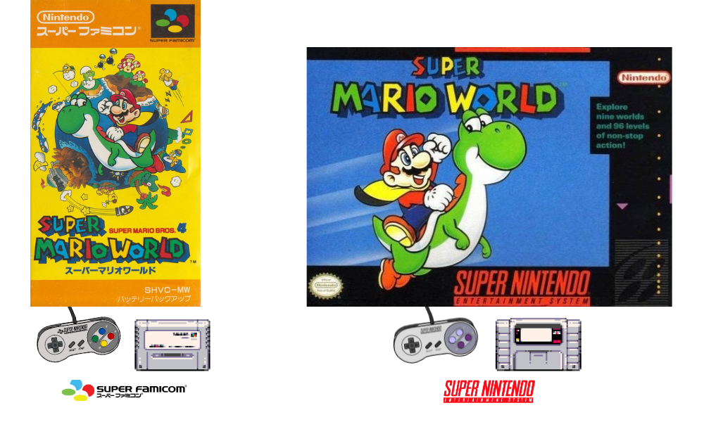
The planet behind Mario gives the impression of the game’s vastness, excitement, and potential for exploration. In contrast, the SNES version features a simple 16-bit blue sky as the backdrop.
Street Fighter 2 (1992)
Another highly regarded game is Street Fighter 2. You were considered one of the cool kids if you owned this game in the ‘90s, and I was one of them. The Super Famicom art box is simply stunning. All eight playable characters are exquisitely drawn, making it worthy of being turned into a canvas painting and displayed on any wall.

In contrast, the North American SNES box design takes a more realistic approach, which I found rather unsettling as a child. Blanka, the wild man-beast fighter, appears downright terrifying in this version. And for some reason, the rendering of Chun-Li's facial features just doesn't sit right with me.
Then there's Ryu, the series' central protagonist and strongest warrior, depicted lying on the floor with what looks like a dislocated right hand - a strange choice, when he should be defiantly performing his iconic "Shoryuken" rising dragon punch, protecting Chun-Li from Blanka's onslaught.
Street Fight 2 Turbo (1993)
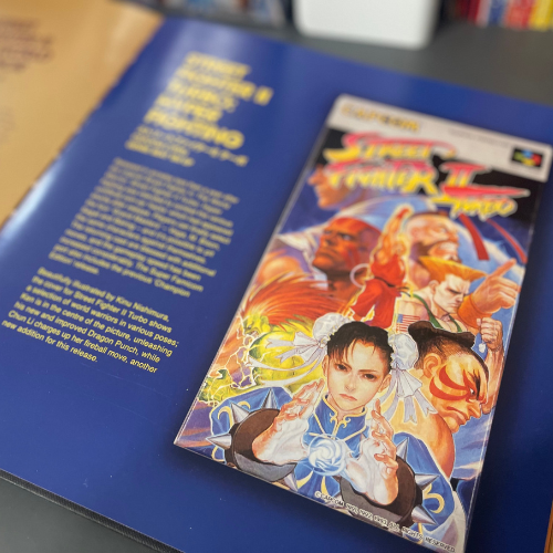
A year after the original Street Fighter II was released, Capcom followed up with the enhanced Street Fighter II Turbo edition. This Super Famicom box art for this version features a dynamic selection of the game's iconic "world warriors" showcased in various action poses.
Ken is positioned in the centre, executing his signature Dragon Punch technique. In the front is Chun-Li, charging up one of her trademark fireball attacks—a new move introduced in this Turbo iteration of the game.
The Super Famicom Street Fighter II Turbo cover stands out as a stunning, hand-painted work of art. Once again. it's the kind of cover that would proudly adorn the wall of any dedicated Street Fighter fan or collector of classic gaming memorabilia.

The SNES cover adopts a more realistic approach again, showing E Honda performing his signature Hundred Hand Slap on Sagat. Oddly enough, Sagat appears to be leaning back in mid-air, a pose I’ve never seen him do in the game.
Interestingly, Dhalsim can be spotted subtly hidden behind the two fighters in the background, a detail that many have overlooked. I recently made this discovery while researching and writing this article.
Dragon Ball Z Franchise (1993-1997)
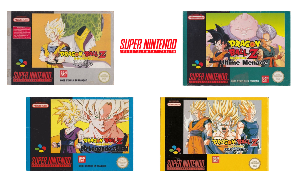
The SNES and Super Famicom Dragon Ball Z box art features original artwork by the legendary manga artist Akira Toriyama. He is one of my favourite manga artists, and Dragon Ball has been a beloved anime for me since the 1980s.
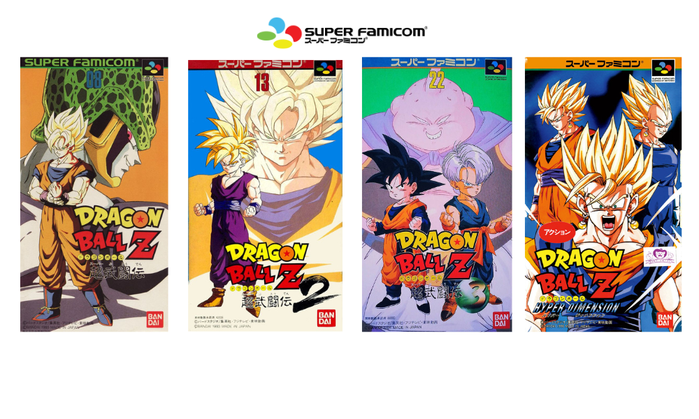
Apart from the portrait and landscape cover designs in both regions, the only noticeable difference is the variation in colour borders on the SNES boxes. Additionally, the artwork may be adjusted to fit the images appropriately.
Throughout high school, my collection consisted solely of Dragon Balls 2 and 3. I vividly remember borrowing Dragon Ball 1 from a close friend at school. We would regularly swap games. I spent countless hours trying to master all the moves at home and then battled it out when we went to each other's houses over the weekends. I was a die-hard fan of Dragon Ball, and my passion for the series remains.
In Memoriam ~ Akira Toriyama
1955 - 2024
It is with a heavy heart that I must share the deeply saddening news confirmed by Bird Studio Japan - the legendary manga artist and creator, Akira Toriyama, passed away on March 1st, 2024, at the age of 68, due to an acute subdural hematoma. 
Losing Akira Toriyama, one of the greatest pioneers in anime and manga history, feels like a piece of my own childhood has been taken away. Toriyama has been a true inspiration, gifting the world with so many beloved creations and captivating stories that have touched the lives of millions.
I have been a devoted fan of Dragon Ball since the very first time I saw Goku on television while growing up. Toriyama's imaginative works have held a special place in my heart ever since those formative years, sparking my love for the medium of Japanese animation and comics.
Though Toriyama is no longer with us, his legacy will never be forgotten. His characters, worlds, and narrative genius will continue to inspire and entertain future generations of fans for many years to come.
R.I.P - Akira Toriyama

Goodbye Tori-Bot & Thank You!


The Legend of Zelda - A Link to The Past (1991)
This game was viral among children who grew up in the 1990s. The Super Famicom cover depicts a more mature version of Link standing confidently in the forest, prepared for battle, while the upright Master Sword looms in the background on a pedestal.

On the SNES cover, a close-up image of Master Sword and shield takes centre stage, with the word 'ZELDA' in red overlaying a golden background. It's worth mentioning that the game's marketing in North America took a different approach, opting for a more serious and mature tone, diverging from the Japanese anime style.
Mother 2/Earthbound (1994)
The original game, Mother 1 (1989), was released exclusively in Japan on the Famicom. Its sequel, Mother 2, was rebranded as Earthbound outside Japan to avoid confusion.
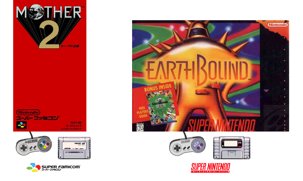
The Super Famicom box art doesn't indicate the game's nature, but it was consistent with the covers of part 1 and part 3, with the subtle art design.

The SNES presented an exceptional box art that exuded a captivating early '90s aesthetic with its psychedelic vibe. The cover, featuring a human inside the head of a giant robot, is far more intriguing. It even came with a stunning free 135-page player's guide, including scratchy stink cards at the time (on page 127 of the guide).
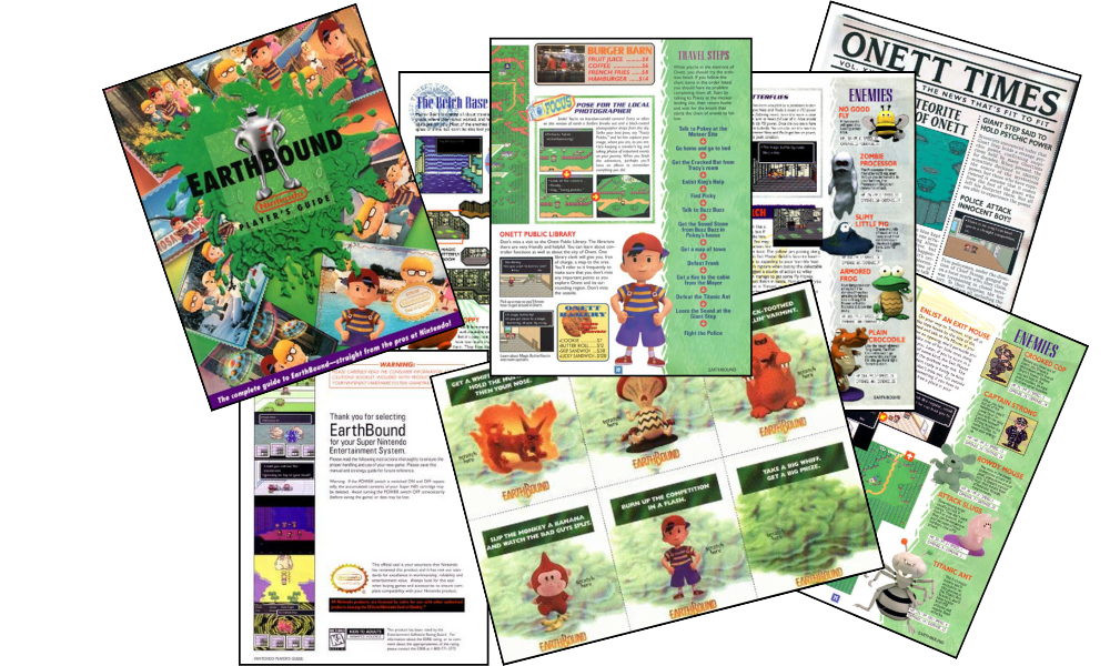
Click here to access the free guide.
Upon its release, the game was priced at USD 60, the standard rate for new titles during that period. This was considered reasonable, particularly compared to games like Chrono Trigger and Final Fantasy VI, which were priced at USD 90 at launch without including a guide.
However, despite the appealing offer, the game could have done better, with only 140000 units sold, considering Super Mario World sold over 20 million units worldwide at the time.
Phalanx (1991)
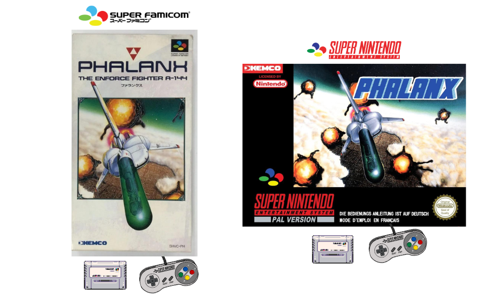
The Japanese box art accurately portrays the game by showing the spaceship skillfully evading enemy attacks with explosions in the background. The PAL version uses the same illustration. However, the cover is surrounded by thick borders, which takes up a lot of space.
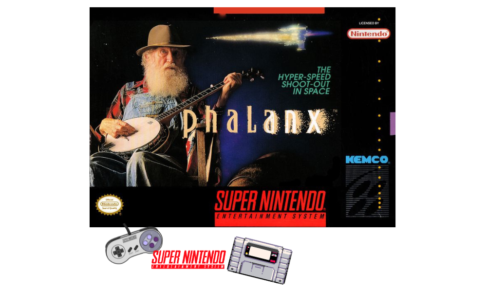
Why is there an old man with a banjo on the cover of a space shoot-em-up game?
Without the subtitle 'The hyper-speed shoot-out in space,' you would be forgiven to think this was a musical game.
This has to be either the worst or the cleverest marketing strategy by the US marketing team, but it is one of the strangest SNES box art of all time.
Matt Guss, one of the box's designers, admitted they deliberately chose this design to stand out from other games of the same genre. He wanted to create an unexpected cover design that would stop people in their tracks when they saw it on the shelf.
Read the identity of the Phalanx Old Man here.
Area 88/U.N. Squadron (1991)
The Super Famicom's box art pays homage to the original manga, featuring the original logo and characters created by Kaoru Shintani, a Japanese manga artist well known for his work in sci-fi, fantasy and hentai comics.
While the game is based on Shintani's manga series, it does not follow the original storyline. However, it incorporates elements like the series' environments, characters, and military craft.
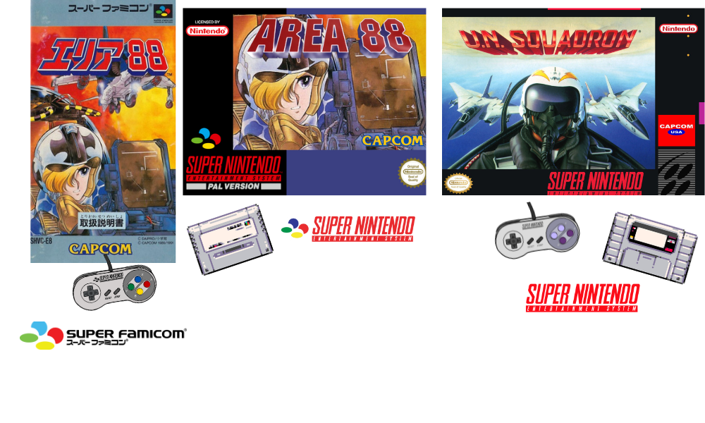
The American SNES version completely ignores the facts, changing the title and cover art entirely and taking on a more serious tone, with its Westernised depiction of a pilot in a cockpit, helmet on, and F15s in the background.
Super Ghouls ‘N Ghosts (1991)
The Japanese box art’s illustration wonderfully showcases all the game's characters. The overall appearance is fun and engaging, with a killer logo design.
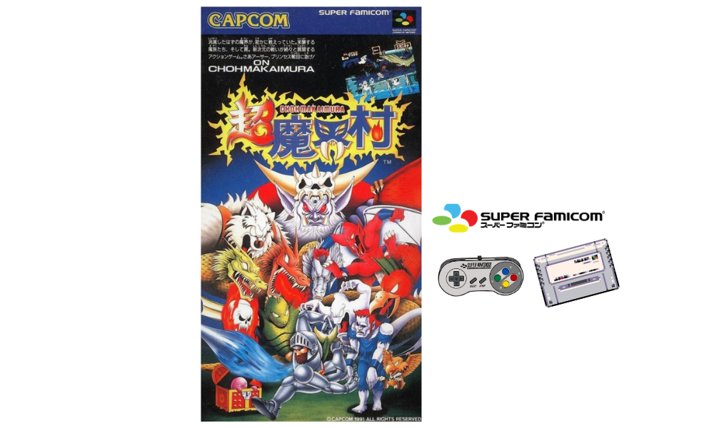
The artwork was created by the renowned manga artist Susumu Matsushita, known for his American comic-influenced style. His portfolio includes "Motor Toon Grand Prix" (1994) and Hudson's "Adventure Island" series (1986), the latter being one of my favourite NES series.
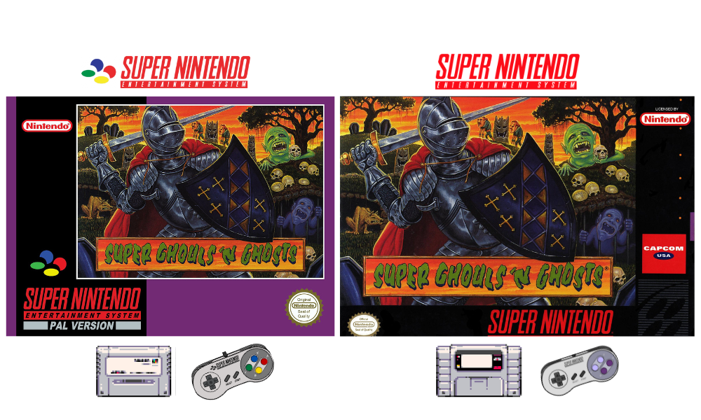
However, the American and PAL versions took a starkly different approach. The cover depicts a knight, presumably Arthur, the protagonist, with his face shield down and an awkwardly twisted right arm gripping a sword behind his head.
Furthermore, the U.S. and PAL versions underwent censorship, with Christian symbols like crosses removed from the game.
Gun Force (1991)
The Japanese box art features the original artwork of Irem coin-op from 1991. The Earth on the cover is pictured against a moody red backdrop, with two protagonists in futuristic armour and weapons.
They are accompanied by battle tanks and an Apache helicopter, adding to the intense atmosphere. The cover art is done in manga style, further enhancing its captivating appeal.
However, these characters were replaced with robots on the cover for the U.S. version. This change seems illogical, given that the characters in the game are those from the Super Famicom cover.

Final Fantasy VI/Final Fantasy III (1994)
The most notable change is the title, which was changed from Super Famicom Final Fantasy VI to SNES Final Fantasy III. Since only two games from the series were released in North America at the time, and this was the third release, changing it to Final Fantasy III to maintain naming continuity made sense.
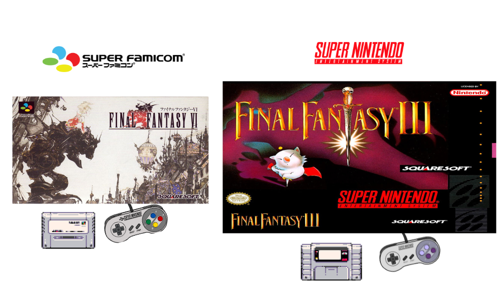
Yoshitaka Amano's artwork for the Super Famicom seamlessly combines elements of science fiction and fantasy, resulting in a truly stunning visual experience. Amano's pen-and-ink illustration for this particular game exhibits a darker tone than previous covers, adding a sense of maturity and depth previously absent from Super Famicom releases. The result is simply breathtaking.
Through my research on this title, I discovered that North American audiences were significantly interested in Mog, the character featured prominently on the box cover.
This emphasis on Mog suggests a possible targeting of younger audiences.
The cover artwork showcases Mog as the central focus, accompanied by a noticeable purple silhouette resembling Doom Gaze, a boss encountered in the game.
It's worth noting that during the '90s, a TV commercial explicitly featuring Mog and FF3 promotions revolved around this character.
Additionally, dedicated RPG communities on AOL focused on Mog. These communities offered engaging role-playing message boards and chat rooms with in-depth discussions.
The games reached Europe in the PlayStation versions in 2002, which were appropriately labelled.
Batman Returns (1992)
With its ageless comic book illustration, the Japanese cover has stood the test of time. Both the U.S. and PAL versions opted for an image from Tim Burton’s film featuring Michael Keaton as Batman, surrounded by four scenes from the movie.
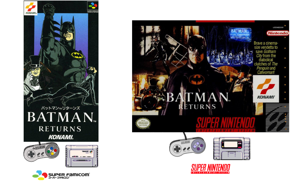
The Super Famicom box art success comes down to the use of the official comic book adaptation of what the franchise is renowned for. While humans age, comics remain timeless.
F-Zero (1990)
Here's a popular title that many racing fans would have played during the SNES era. Both covers choose different styles, ultimately coming down to personal preference.
he Japanese version showcases a manga-inspired hand-drawn cover, including additional characters. It goes a step further by featuring additional characters on the cover. The futuristic city backdrop is meticulously detailed, offering a more immersive visual experience than the SNES version.

I can only assume the "F" in F-Zero stands for "Formula." According to the SNES manual, the game was inspired by F-1 racing. Alternatively, it could also represent "Futuristic," as the slogan on the SNES cover states the race is set in the 26th Century!
Super Castlevania IV (1991)
This is the first Super Famicom game to opt for a landscape cover. The artwork fills the entire box, featuring the protagonist, Simon Belmont, set against a vibrant red Transylvanian background surrounded by iconic elements such as Dracula, his castle, bats, and swinging chandeliers.
Be the way, it looks like Simon is a part-time member of a heavy metal band.

The SNES version effectively captures the game's dark and sinister atmosphere. The cover features skeletons, Medusa, and a serpent in the background, seemingly attacking Simon at once. The intense onslaught of enemies depicted in the artwork creates a sense of impending danger for the protagonist.
The PAL version uses the same box art as the U.S., but the thick borders occupy a significant amount of space, detracting somewhat from the overall visual impact.
Of the three covers, the U.S. version is the most impressive. Most users voted for the North American edition in a Reddit forum, considering it the superior choice.
Chrono Trigger (1995)
It's another cover art by my favourite manga artist. The Japanese version has a more straightforward design, with all characters standing against a white backdrop, emphasising their importance. Toriyama adopts his trademark Dragon Ball Z illustration style, breathing life and personality into his creations.
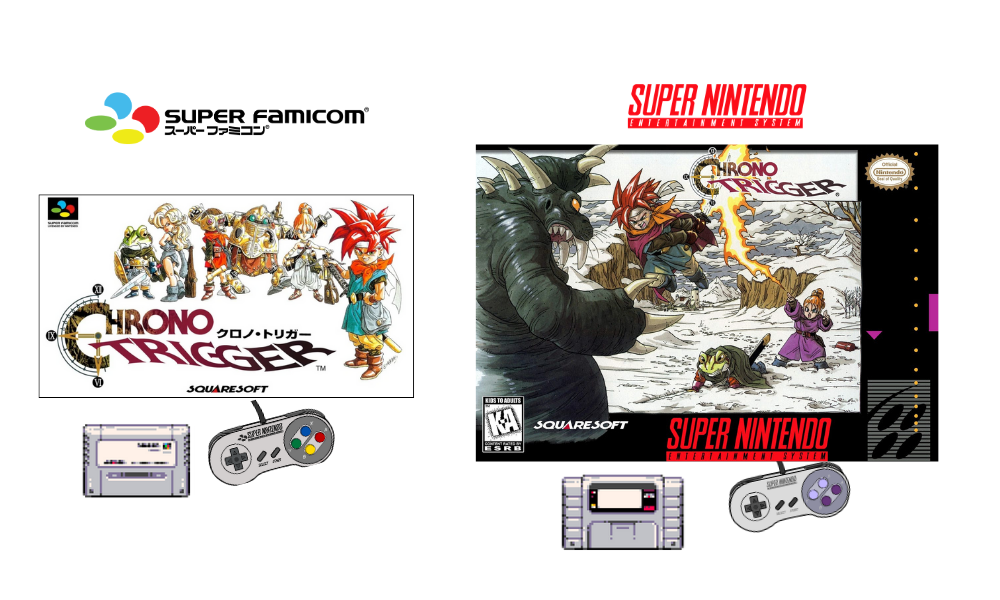
The U.S. box art features an action battle scene. A snowy terrain accentuates the characters as they wage battle with flaming swords and determined expressions. This cover is impressive but marred by the infamous thick black SNES border that consumes much space. Nevertheless, the art remains distinctly representative of Akira Toriyama's signature style.
Contra III - The Alien Wars (1992)
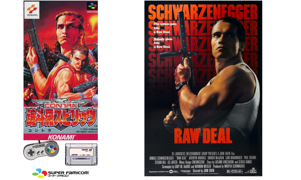
The Japanese title is "Contra Spirits," but it was rebranded as "Contra III—The Alien Wars" for the North American market and "Super Probotector: Alien Rebels" for the PAL version. Confused? Yeah, me too.
Interestingly, the Japanese box art features an image from Arnold Schwarzenegger's 1986 film, "Raw Deal."
The cover features Arnold, or Jimbo, the main protagonist in the game. The inclusion of the second character, Sully, establishes a connection to the game's storyline.
This isn't the first time Japanese game covers borrow from Western culture; "Gun-Dec" (known as "Vice: Project Doom" in the West) used an image of Bruce Willis from "Die Hard."
The U.S. version, subtitled "The Alien Wars," exhibited a less realistic style with unusual alien designs. The black border made the already difficult-to-read text even more challenging. But the artwork is pretty cool.
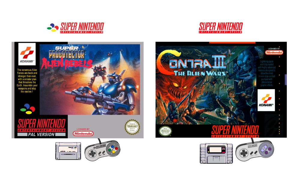
The PAL version replaced humans with robots to lessen violence, enabling its release in Germany despite the game featuring human characters. It appears that the cover art of games in Europe does not necessarily need to be directly related to the game to gain approval.
Undercover Cops (1995)
Undercover Cops was exclusively released in Japan and was planned for an SNES release, but that never happened.

The SNES artwork represents the unreleased American box design. It's not surprising anymore that American publishers ignore a game's original style and add their little tweaks. For this cover, a ‘90s action film vibe was chosen in design; at least, it still represents each character on the Super Famicom cover.
On the other hand, the Japanese Super Famicom cover has aged like fine wine. Its distinct comic-book-inspired aesthetic gives it a truly unique and captivating visual appeal.
The price for this rare Japanese gem can fetch over AUD 1,000 on the secondary market, which speaks to the high demand and desirability of these original, region-specific box art designs among retro game collectors. The stark contrast in artistic direction between the SNES and SFC covers underscores the importance of preserving a title's original creative vision rather than conforming to perceived Western market preferences.
It is important to note that the gaming experience over 30 years ago differs from today's. It wasn't until 1994 when the Sony PlayStation 1 and 1996 Nintendo 64 were released, that games and consoles had the same design and branding worldwide.
In the decades since, the gaming world has seen a remarkable resurgence of retro gaming in recent years, capturing the interest of gamers and collectors alike.
Re-releases of classic consoles, such as the NES and SNES Classic Mini, Sega Genesis Mini, and the Atari 2600+, have gained significant attention and popularity. These consoles are highly sought after by both collectors and newcomers to the retro-gaming scene.
There are limited availability at My Retro Shop.
Numerous modern games with a retro-inspired aesthetic have also debuted on next-gen consoles, including titles like The Messenger, Shovel Knight, Cuphead, and Celeste. These "neo-retro" experiences have further fueled the resurgence of interest in classic gaming.
The cost of collecting original retro games, especially Complete In Box (CIB) editions, has been steadily rising. Prices show no signs of decreasing and will likely continue to rise as demand for these vintage treasures remains high, with fewer becoming available or getting lost over time.
While emulation provides a convenient way to experience retro games, for many collectors, owning the physical copies of the games and consoles from their childhood evokes a sense of nostalgia and authenticity that can't be replicated through digital means alone.
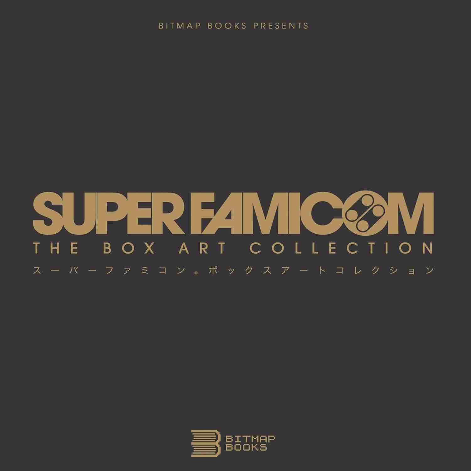
Super Famicom - The Box Art Collection - Bitmap Books
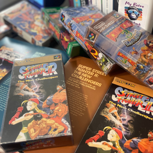
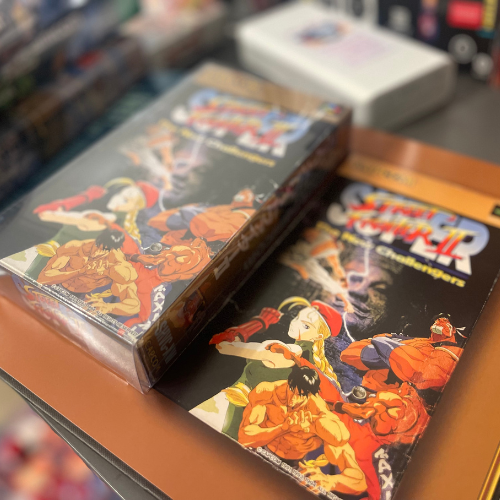
As a celebration of this unique Japanese artwork, Bitmap Books presents Super Famicom: The Box Art Collection. This glorious hardback features around 250 titles, including rare and never-before-documented box art, professionally shot and presented life-size. I compared it with my own collection, and it looks like I practically pulled the games right out of the pages (see photos below).
Sourced from renowned collector Stuart Brett (aka Super Famicom Guy), the book includes critiques of the artwork and interviews with other collectors.
With the shift to digital gaming, this compilation preserves the artistry of these cherished Super Famicom box designs.
Stay Retro!
David - The Retro Game Hub
Check out my other blog - Nintendo vs Tengen – The Battle Over Unlicensed NES Games
Recommended Product

Retro Handheld - Anbernic
Discover the Anbernic Handheld — preloaded with over 10,000 retro games from various eras up to the PlayStation, this compact and portable device is perfect for gaming on the go!
Special offer: Get a FREE carry case with your purchase—while supplies last!
FREE DELIVERY WITHIN AUSTRALIA!
Let's Connect on Social Media!



"Some of the links on this site are affiliate links. If you click on one of the product links and then make a purchase, I may receive a small commission at no additional cost to you. Please know that I only recommend items I use and genuinely believe will benefit my readers. Your support through these affiliate partnerships helps me continue providing valuable content and keeping this site up and running. Thank you for your understanding and for being part of this community.”